3 Tips to Getting Started with SEO
When you work in Information Technology, keeping up with Google is a lot like checking the weather. You can avoid keeping up with what’s coming if you want, but by doing so you risk being caught off-guard in a downpour. Simply by thumbing through the most prominent tech blogs on a routine basis (in conjunction with setting up a few Google Alerts) it’s easy for me to keep track of what major changes are coming about in IT, and on the web as a whole. This month, I want to share with you a major change that’s recently occurred to the Internet-giant Google, and their approach to web-ranking. We’ll explore what you can do to leverage their most recent changes, and explore how to utilize these changes to enhance your veterinary practice and garner more business than ever.
The announcement that Google would be factoring mobile compatibility into their comprehensive web-rankings beginning April 2015, caused immediate shockwaves across the web. No modern day business is truly exempt from these changes, that is unless of course they don’t have a website, or use the Internet at all (which is an entirely different issue). Modern, competitive veterinary practices rely more than ever on the web, and consequently, they rely on Google too. That’s because Google sets the tone for what exists on the Internet as a whole, controlling, monitoring and distributing an unthinkably large amount of data each day. In fact, Google possesses over 65% of all search market share (yes, feel free to confirm this statistic with a Google search), effectively making or breaking what exists on the web in any capacity. While it may be easier than ever to start a blog or launch a website, it’s much harder to truly thrive on the web. This is why my goal is to help you adapt and leverage the absolute latest technological developments to enhance your veterinary practice.
As of late last month, Google has overhauled their web-ranking system, and is now incorporating the functionality of websites on mobile devices as a major component of Google Rankings. I know that pet owners and veterinarians alike use their smartphones more than ever, and Google has inevitably caught onto this trend. If a website is not optimized for mobile, it will now fall dramatically in search rankings conducted on mobile deviced to reflect this shortcoming. In other words, if your veterinary practice website is not comprehensively optimized for both mobile and desktop, your business is at risk of losing traction and falling behind the competition. On the other hand, practices that can rapidly adjust may be able to outpace competition that has faltered behind such adjustments. If practices choose not to adapt to the new formula, they risk losing out on a significant amount of business.
If it isn’t on Google, it doesn’t exist.
Jimmy Wales
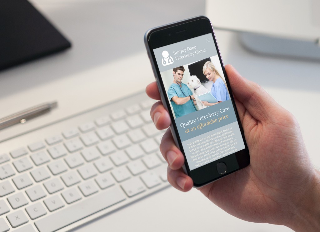
The trend of accessible data on the web is now skewed toward mobile, and Google has fully adjusted to this reality. Comprehensive Simply Done Tech Solutions analytics finds that on average, 33% of all organic (non-paid) traffic generated to a veterinarian’s website is from mobile. It’s important to note that this percentage is increasing over time, and in some cases, veterinary practices actually secure more mobile traffic than they do via desktop. So what makes a good mobile website, and how can you ensure that you’re well equipped moving forward? Look below for some examples of a successful mobile build, and read on for a step-by-step guide on how to optimize your veterinary practice’s website.
A good mobile website strips down the best of a desktop site, and makes it easily available for the user to access on their mobile device. Mobile devices are smaller and more compact, and thus the aesthetics and build of a proper mobile website reflects this. A good mobile site will emphasize big buttons that are accessible on the go. This might mean a tap-to-call button that lets the user call your primary business line with a single finger-tap. The same functionality can be lent to locators and GPS features that can ostensibly bring a new client right to your door. A proper mobile build will show off the best of your brand with a custom color pallet and seamless links to Social Media. Well-conceived and implemented mobile builds will also boast simple bits of information that any prospective or current customer might need to know (think location, phone number, slogan). Now that we’ve got the basics down, let’s look at a simple step by step process to adapt your website to mobile, today.
3 Simple Steps for Adapting to Mobile
1.) Check your current websites mobile compatibility with the Google’s Mobile-Friendly Test Tool. Simply copy and paste your primary web URL into the tool to begin.
2.) Analyze your results, which is made easy by Google. You might be in good shape with your existing website, or you may receive a “Not mobile-friendly” rating. If the later rating is given, Google will provide you with several options to help make your website more mobile-friendly than before.
3.) Based on your results, you may wish to contact your current Web Developer, or explore an array of other options. There are many website development companies in the veterinary industry (i.e. Vetstreet, LifeLearn, etc.) that have an easy approach to mobile-optimization.
In an age of rapid digital transformation, keeping up with the breakneck speed of change can be difficult. By staying tuned to SimplyDoneTechSolutions.com, you’ll know what changes are coming your way, and how to adapt accordingly. This time it’s mobile-compatibility, but who knows what lies around the bend. I know that your veterinary practice deserves to thrive now, and into the future.